Welcome to our blog on the supply network mapping application in eVSM Mix with supporting visual analytics. In the next few minutes we will discuss how it can be used to visualize and improve aspects of lead time, inventory, cost and resiliency of the network.
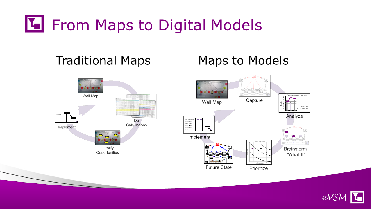
Traditionally segments of the map are drawn by hand on the wall or using electronic tools like Visio, Powerpoint, Excel, Lucid, SmartDraw and many others. eVSM Mix in contrast provides a specific application for supply network mapping that’s complete with icons, related data, built-in equations, built-in charts and an integrated improvements framework. Its goal is much better productivity for the team, better and validated improvement ideas and a reusable network model that can provide more frequent value and be updated as needed.
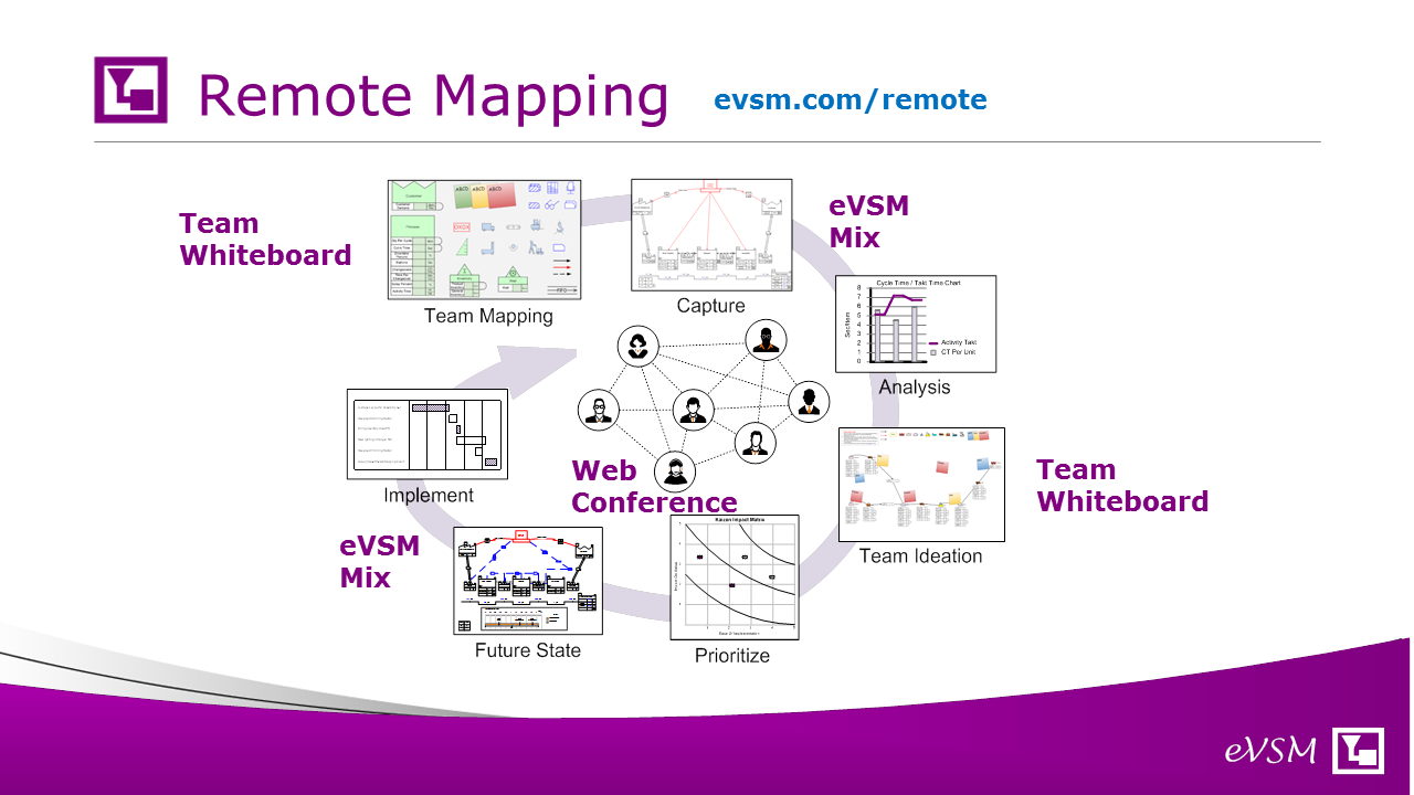
Often there are targeted physical events where team get together to map out pieces of the network on a wall and then capture and analyze the result. In todays digital world and with the need for social distancing, the wall can be substituted by an electronic whiteboard in support of the initial capture phase and later ideation after the analytics are available. We have a related blog that speaks to this remote collaboration topic (evsm.com/remote).
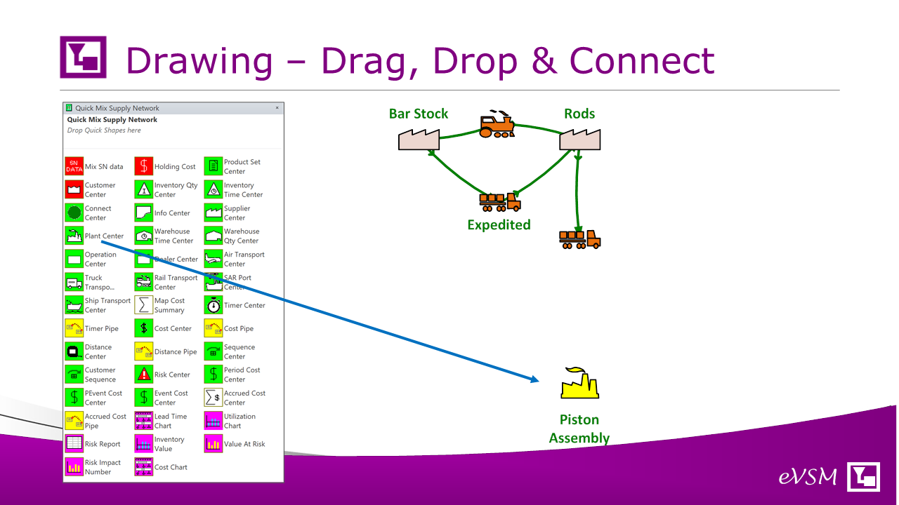
A supply network map can be drawn with simple drag, drop & arrow connection. No need to create any icons or arrows as the stencil provided has icons (with underlying data) for the main facility types (supplier, warehouse, plant) and transportation types (Truck, Train, Ship, Air). Colors are pre-defined and correspond to colors in the associated lead time chart.
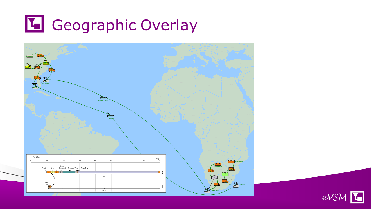
Its possible to overlay the network map on geographic images where its helpful. Areas of the map can be exploded to more detail also with zoomed-in maps when needed.
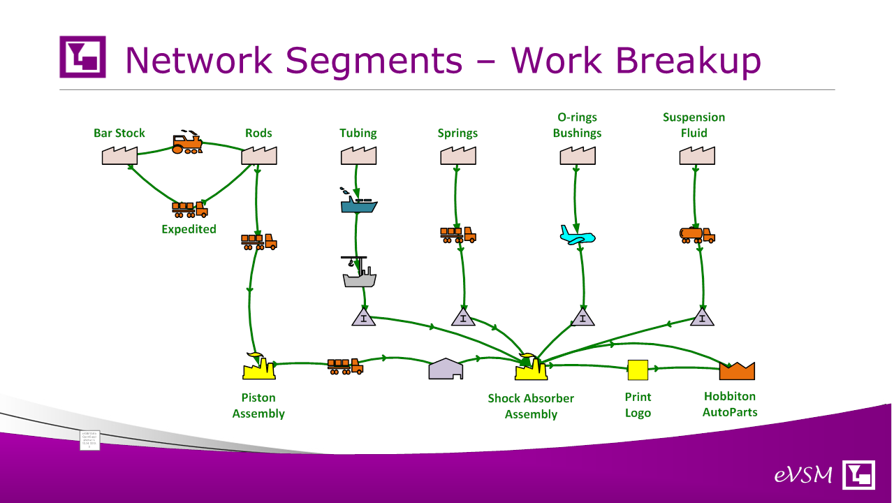
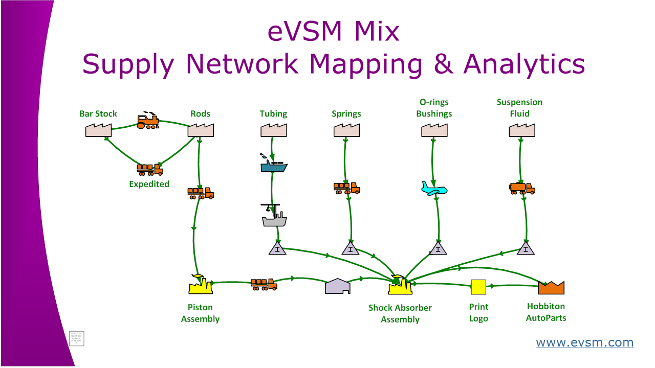
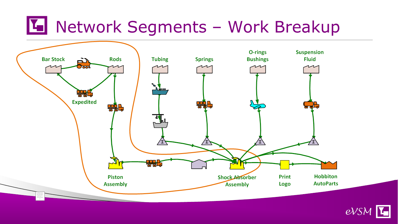
Networks are typically drawn for product families and if complex can be broken out into their segments for simultaneous work by different team members and then later combined.
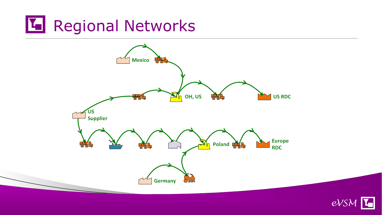
Even where the network corresponds to a single product family, if may involve different routings depending on the product destination. In the example, the product logistics are very different depending on demands at the US or European regional distribution centers. This variance makes calculations and even visualization of the network more complex so eVSM Mix provides specific support for routing, parameter and demand variations to create views that are easily understood while preserving a master model with the data.
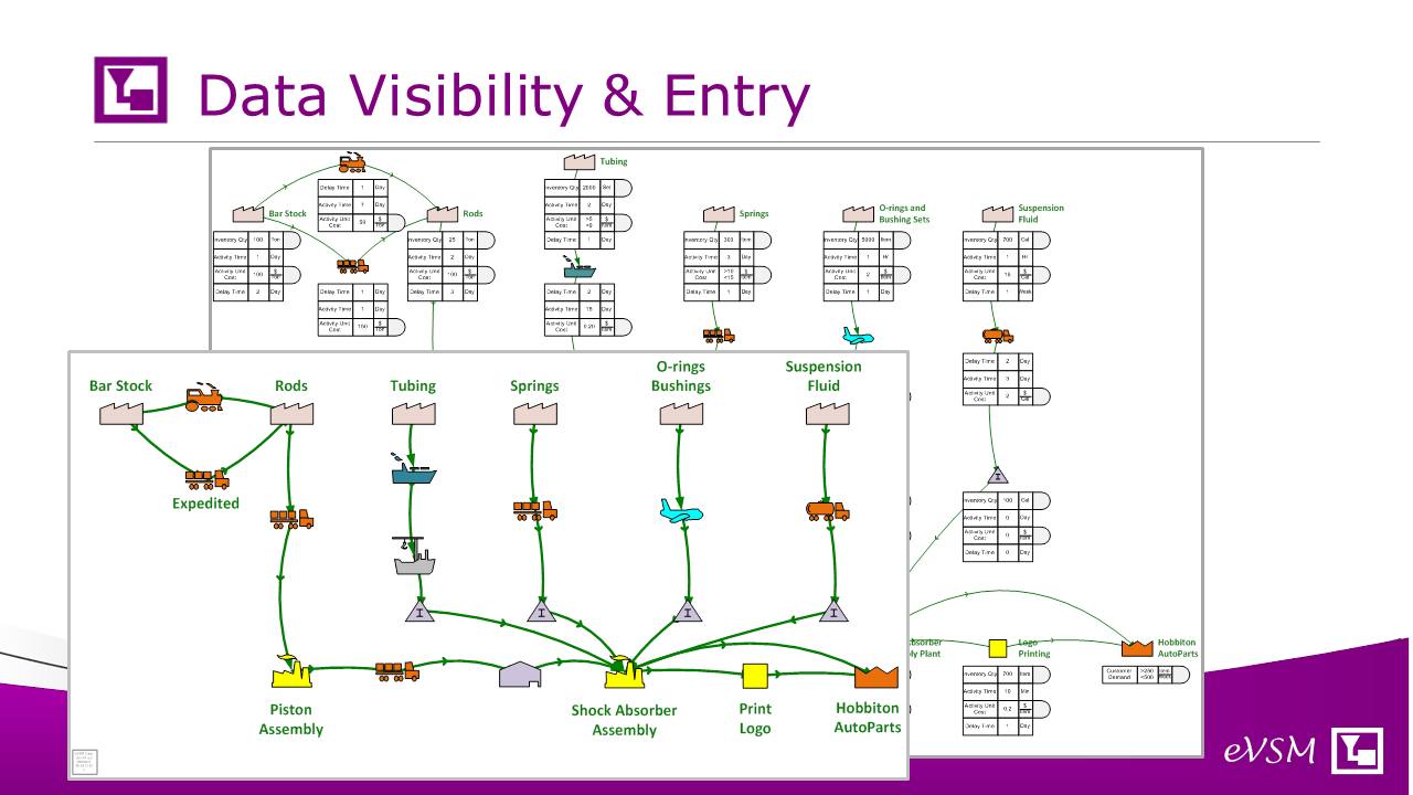
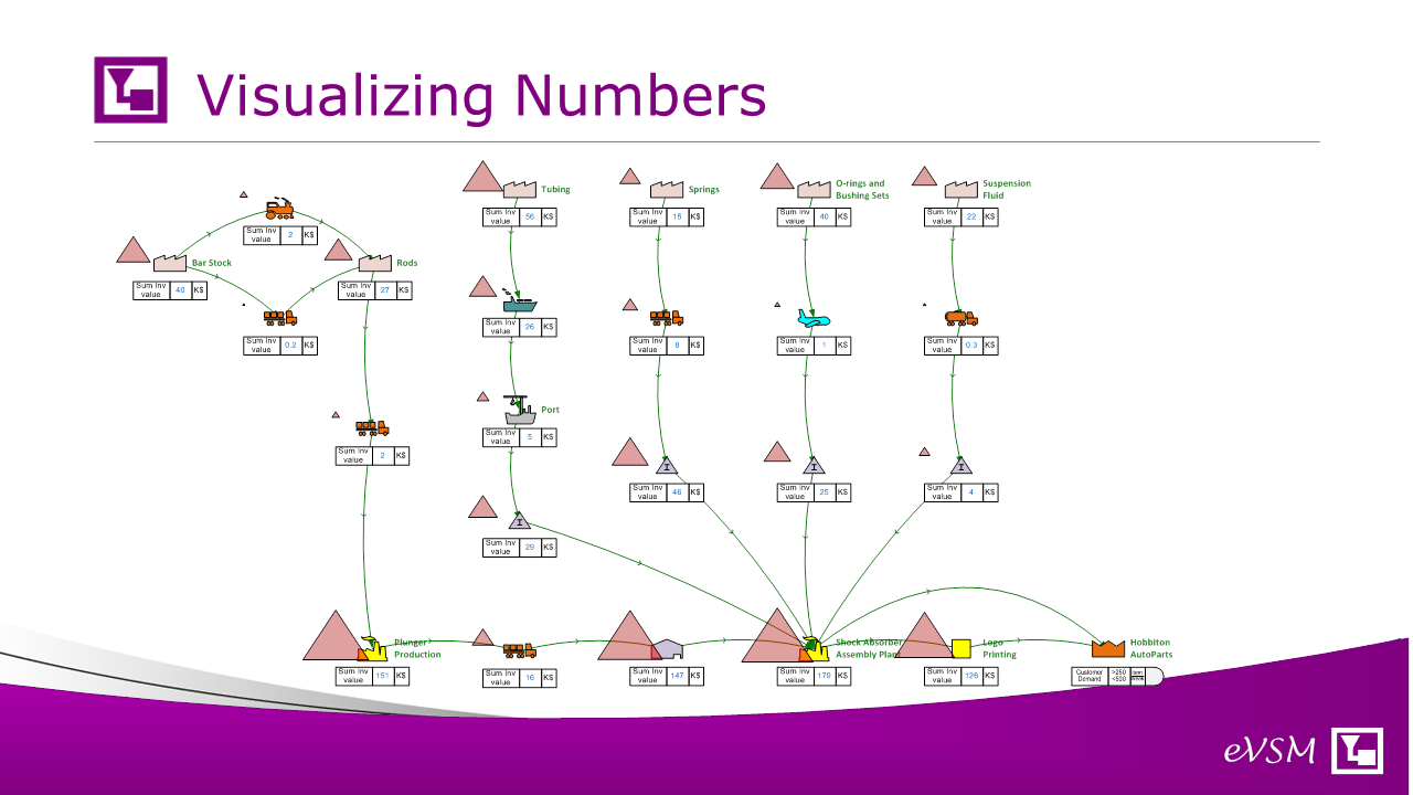
Once the network is sketched out, there is a hide/show function which exposes the related data values for both the nodes and the arrows. There is a built-in scaling function to avoid any overlap issues. This avoids the grunt work of creating a map for visual purposes and then having to recreate it in a spreadsheet or other software for data collection and analysis.
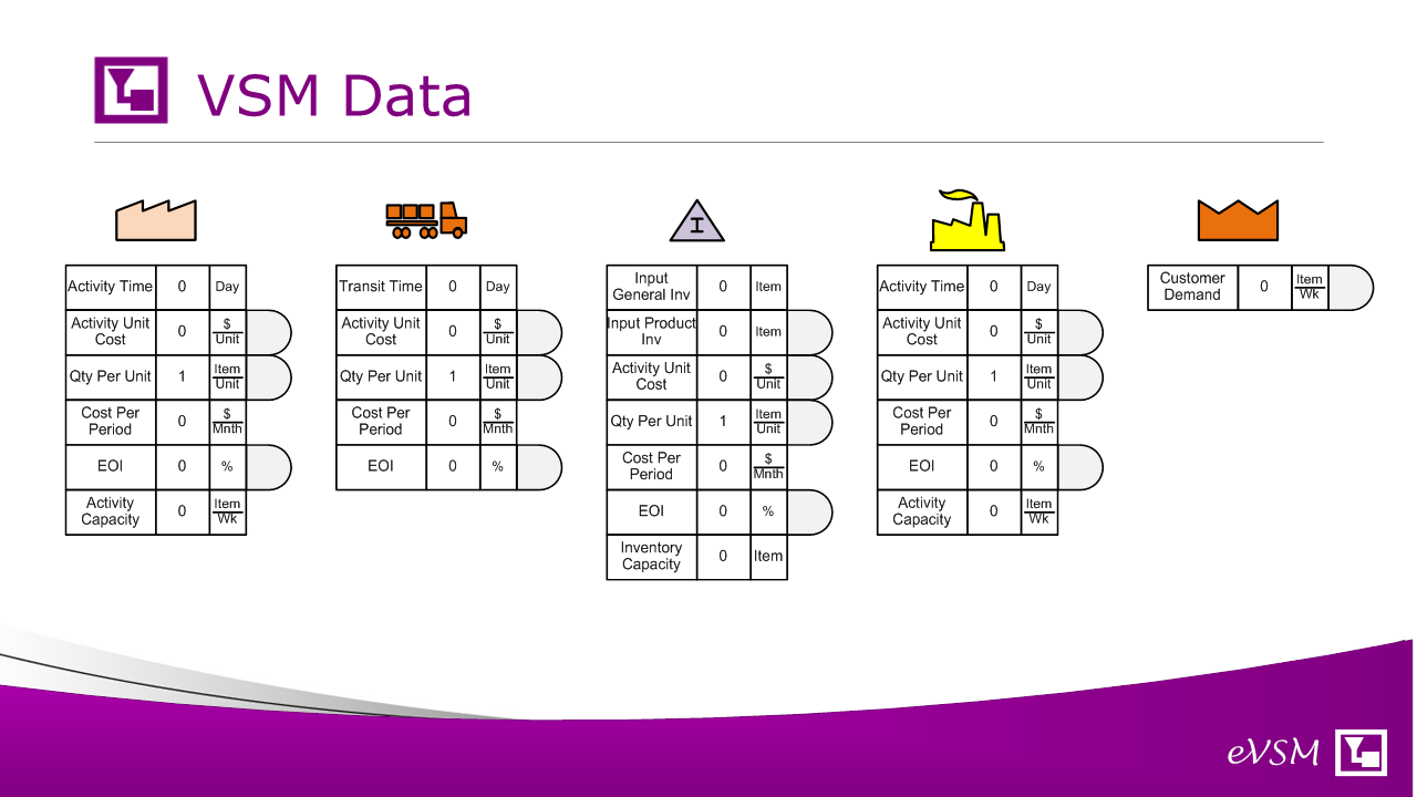
Here you see the basic data variables for time, cost and inventory. No need for debate on the variables or what they mean as there is a variable glossary that can be placed on the map. Time, Currency and Qty units are flexible and can be changed easily throughout the map. Data input can be directly on the map or via a spreadsheet. New variables can also be added if needed.
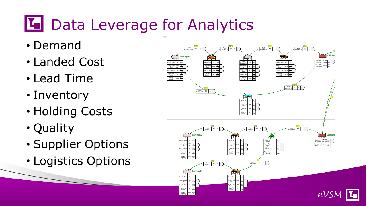
The map is useful without data for network visualization, but with some simple data its so much more powerful. There are built in analytics to support metrics like lead time, landed costs, inventory holding costs so that improvement ideas can be metrics based and what-if studies are easy to do.
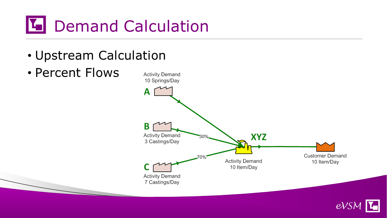
Lets look through some of the simple concepts and calculations in the map. Demand for products is declared at the customer shape and is then back-calculated to all the upstream nodes. Percent values on the arrows control the demand propagation. For example, in the image, the plant XYZ gets castings from either supplier B or C. The arrows indicate that 30% of the demand is met by supplier B and 70% by supplier C. So if the plant needs 10 castings per day, the demand on supplier B is 3 castings per day.
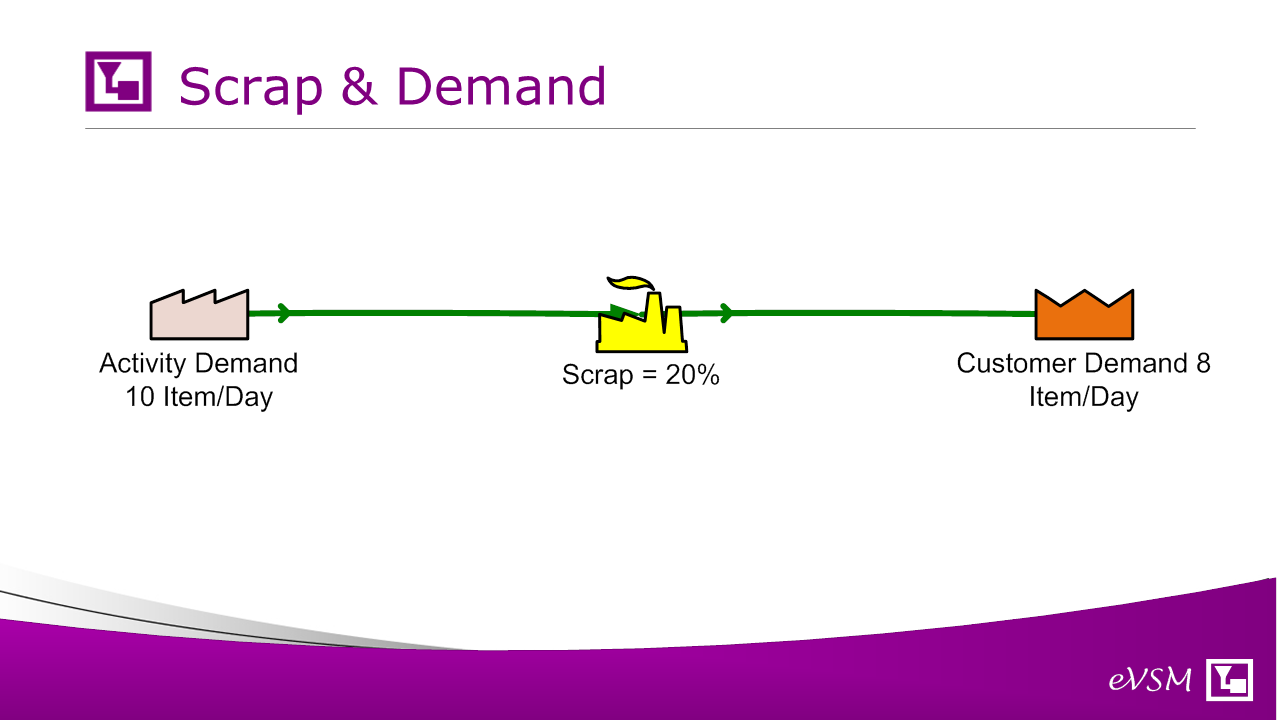
If there is scrap at a network node than it causes an increase in demand upstream.
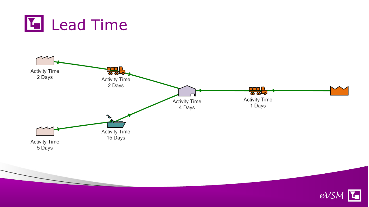
Lead time is calculated for each unique leg in the system. In the picture above there is a lead time of 9 days and 25 days. Lead time charts for each leg can be plotted to scale and are color-coded by the node colors.
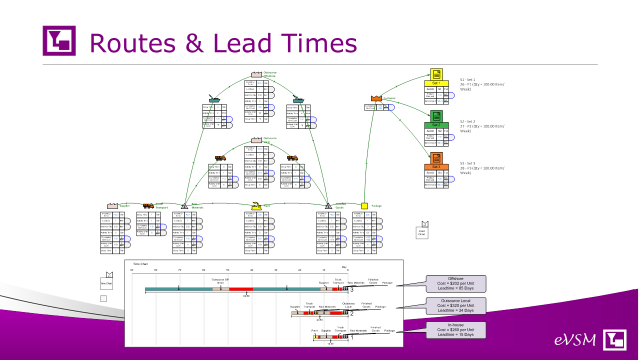
Here’s a lead time chart example for the three unique legs from the supplier to the customer. Each leg would also have cost and inventory characteristics.
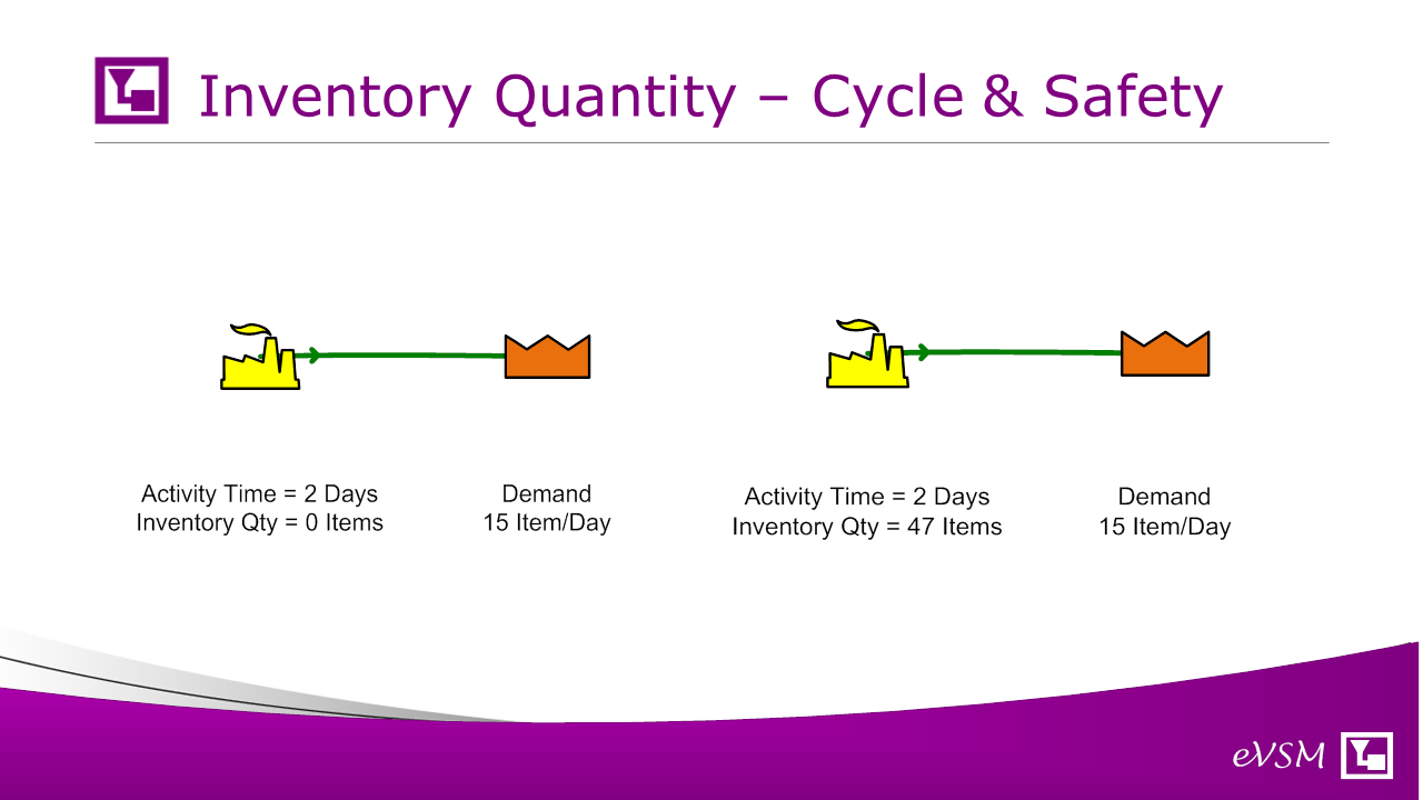
If an item takes 2 days to go through a facility then there is an implied minimum 2 days worth of cycle inventory there. There could be a greater amount if there is also an additional safety stock so you can input just the time or the inventory quantity as appropriate.
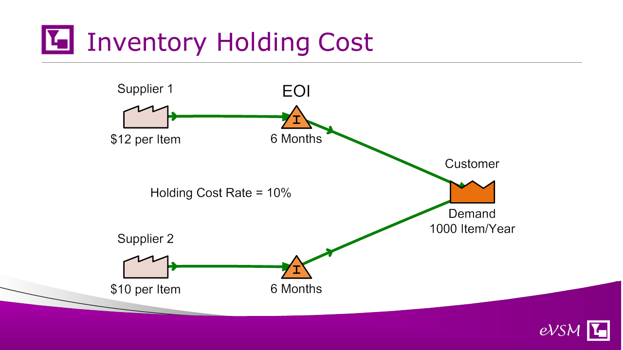
The value of inventory is tracked through the network from upstream to downstream with each node (like transport) adding to the value of one unit. Based on the inventory quantity and knowing its unit value, we can compute the annual holding cost of the inventory. If the inventory is externally owned however (by the supplier for example), it can be so designated. In the example, there is an option of purchasing from supplier 1 or 2 with tradeoffs between the unit cost at the supplier and ownership of the inventory stock.
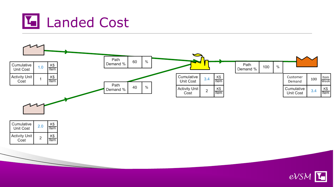
Node costs can be cumulated through the network to help understand impact on landed cost at any destination.
Once the analysis is done, some of the improvement areas associated with specific components or suppliers can be extracted and worked upon in more details. There are built in selection and map extract functions to make this easy. For a particular segment you can even put the current state and future state on the same map to see clearly what will change and its impact.
Analytics are calculated for lead time, inventory, cost and the numbers can be visualized using gadgets. In the example an area gadget is being used to visualize inventory at different points in the network. Other visuals and charts are available to help the team focus on the main issues and validate improvement ideas.
In summary, eVSM Mix Supply Network application is a big jump over basic diagramming tools. It makes drawing and data entry fast leads to better improvement ideas via its analytics, and creates a reusable mapping model. It is used by some of the worlds largest companies to visualize and .adapt segments of the overall supply chain for selected product families.